
 Call it a generational thing, but I’m not much of a reader of online magazines. I still prefer to ingest the bulk of my written content on paper. However, I do like this entry into the category from Cisco. Focus is a monthly online magazine to “spotlight the latest trends and news on technology, business and culture affecting the technology industry.”
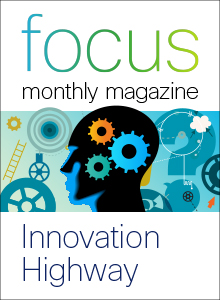
In part, I like this magazine because of the title of this issue: Innovation Highway (New Ideas Transforming Technology). Catchy and current. It’s what drew me to the content in the first place.
Part of what I like about this online magazine is that it doesn’t try to mimic a hard copy magazine. Some online magazines use the look and feel (well, not so much the feel, of course) of their offline counterparts–with covers, page corners that appear to turn up as you get close to the edge, and two-page spreads. Sometimes I find it difficult to navigate and find content in that format. Don’t get me wrong, it’s a cool solution to the challenge, especially to deal with a lot of content. But somehow it has always felt a little bit wrong to me; like a cheap imitation of the paper magazines I love so much.*
The graphic front page of this online magazine points to nine articles related to technology innovation. A couple of the graphics underlying the titles are a little too busy for my taste, but in general this format works for me. When you mouse over the graphic, you get a little bit more information about the content on the other side.
One thing that didn’t quite work for me: the links to the video content. Each graphic includes the start arrow graphic indicating that the image links to a video. But I missed that. It would have been helpful for the text in the box that appears in the mouse-over to indicate it was a video. (This is mostly because I’m not a huge consumer of videos online either. Hmm. Makes you wonder what kind of content I do consume online, yes?)
There was also a difference in the way blog content or features stories written for the magazine appear in the mouse-over boxes; mostly inclusion or exclusion of the authors’ names. And I’m not sure how I feel about it. Why not share the names of all author for any piece with a byline?
But I’m just being picky at this point. I think this is a neat way to make related content available–it’s curated and short and sweet. And who doesn’t love that?
Further Analysis
- Size
With links to nine pieces of content, this is just the right amount. My research (my personal focus group of one person, who looks a lot like me) indicates that in a format like this, the sweet spot is five to nine pieces of content. - Format
Really like the graphic boxes with as a table of contents. Much nicer for an online environment than a standard, text table of contents. Though, again, I wouldn’t use this format for much more content than this. My focus group loses focus when she has to navigate too much graphical content–her eyes glaze over and then you’ve lost her. - Salesy quotient
Very low - Educational quotient
High
Curating this content this way is all about educating the customer. I like that.
Your thoughts? Do you like online magazines? How does this one work for you?
* Bookmarking a page online or writing down a reference is just not the same as tearing out the paper page (or a part of the page). Even if I do end up just looking up the book title or the article’s author online. There is just something about that tactile experience I will always miss online.